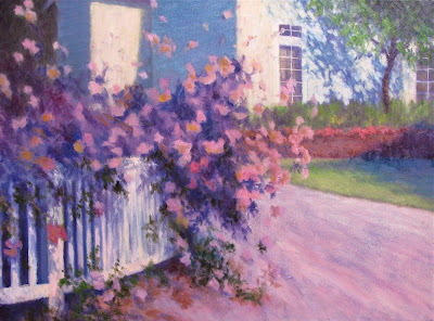
Work in Progress 18x24"
by Susan Roux
Good design. How important is it? Is it important to you?
A good design will hold your viewers eye, sending them on an exploration of your entire canvas.
It isn't extremely complicated. As a matter of fact, it can be quite simple. Keep your viewers interest. How do you achieve that? Shake it up a bit with variety to keep the eye stimulated and traveling about. You can focus on any of the design elements, use them in proportions near 2/3 to 1/3 and you're already off to a great start.
Design comes in right from the start. It isn't something that just happens on your canvas. Consistent good design is planned. When you select a photo or arrangement to paint, there's always something about it that struck you, otherwise you wouldn't have chosen it in the first place. Identify that. Know why you've chosen a particular image to paint.
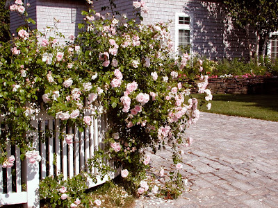
Here is the image I'm working from. It's quite obvious by the way I took this photo that the rose covered fence is what struck me most. If you think in terms of thirds, it's covering about 2/3 of the canvas. Rather than begin with an intense drawing of this complex scene, I chose to place my basic design lines first.
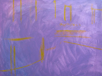
As I painted them in, I adjusted them. Though I was putting lines, my mind was imagining the bulky shapes these lines represented. I had to move several of them. It's a great time to back away and imagine your image within the boundaries you've created. At this point I was concentrating solely on design. Where am I going to place the components in my painting and how will they interact with each other in this placement?
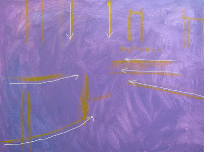
Notice how the lines already travel your eye in a unified direction. As I stepped back to imagine my scene, I thought of the direction things were pointing. Keeping in mind that my floral fence was my center of interest, I could see the movement in my painting was already supporting that. Don't loose sight of your initial idea. If it remains your goal throughout the painting process, the result will be more powerful than if you switched ideas on yourself along the way.
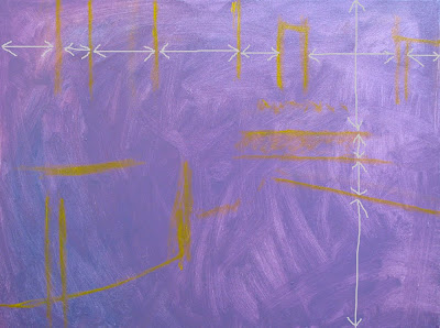
Next I looked at intervals. To keep the viewers eye interested, variety is necessary. Were my intervals varied enough? Not at first. I had to move most of these lines, because as I followed my photo, the lines seemed to be evenly spaced. For the sake of a painting, even if representational, it's better to create interest than to copy an image precisely. (Save that for when you're doing portraits.)
Paying attention to the bare bones of your painting is simple. By doing so, it allows you to concentrate on what you've created that is already working for you. In this case I identified direction. Don't you just love pointers? Make sure their helping you and not pointing the viewer in the wrong direction...
As I continue to develop this painting, I'm keeping in mind this directional movement. I'm supporting it with the colors I'm choosing and the values I'm placing. The bare bones are there to help me, but it's necessary to keep adjusting things as I go along. This will help me build upon the initial structure. Concentrating on good design is a good way to improve your work.
I'll continue to show you the development of this painting, explaining my thought process as I make choices. You'll see how the various elements of design come into play individually. Breaking things down simplifies the process. So rather than have to concentrate on all the elements of design at once, thinking of them one at a time and adjusting them, just as I adjusted my initial lines, becomes easy to understand.

Great Article! Lovely Painting!
ReplyDeleteIMO "good design" begins in black and white, and as a refinement maybe 3/8-5/8. but all this is obviously subjective.
ReplyDeleteGreat post. Love seeing the photo and hearing your thoughts.
ReplyDeleteplus que les proportions.. c'est les fleurs qui sont importantes.. ici nous croulons sous la neige!
ReplyDeletebonne année 2011!!!!!!!!!
Lovely painting, and a well thought out post!
ReplyDeleteThis was very interesting! Thanks! I'm not good at design and composition. I just draw it the way I think it should look, and hope for the best! Not a very good approach. You're painting turned out beautifully! Congratulations!
ReplyDeleteThank you for sharing Susan. This is so helpful. I have learned so much from reading great blogs like yours.
ReplyDeleteSuch a thoughtful post and so nice of you to put on your teacher hat.
ReplyDeleteI love that tree shadow on the house! And look forward to seeing this painting again as it progresses.
J'aime voir danser tes roses et je me transformerais volontiers en petite abeille pour venir y butiner.
ReplyDeleteTes tonalités de roses les rendent très légères.
Bisous
Great blog...Lovely painting...
ReplyDeleteReally enjoy your blog! Wonderful interpretation of the photo . . . love the license you took with color . . . beautiful!
ReplyDeleteHappy New Year! Hope you have a healthy and productive 2011, keep warm in this Maine winter, too!!
ReplyDeleteBeautiful colors in this painting. I love all of your paintings and really enjoy reading your posts!
ReplyDeleteYou must change reality to make it more interesting. And also to look somehow more real.
ReplyDeleteI love it that you take the time to show us the steps of your journey. Lovely painting. I love your blog.
ReplyDeleteGracias, por tu visita, estupenda obra i procedimiento.
ReplyDeleteSaludos i hasta pronto-
just beautiful! great post, i so relate. i also love seeing your process. thank you for sharing your thoughts and wonderful work!
ReplyDeleteLove seeing your process! Can't wait to see more!
ReplyDeleteHello Susan,
ReplyDeleteIsso é uma aula de pintura!
Lines, colors, inspiration!
congratulations
Feliz 2011!
Superb post. Enjoyed seeing the photos and reading your explanation. Happy New Year!
ReplyDeleteThis post was so informative! Being self-taught, the strategy of design has always been a mystery to me. Thank you so much for showing each step and how it comes together. The shadow and light you have going on here is simply beautiful!
ReplyDeleteI enjoyed reading this article, design process is so important. It's a lot easier than changing something when the paintings done and dried, once major changes need to be made you have to start a new painting. It's so easy to steam ahead only to find it doesn't work well and you end up scrapping it. I look forward to seeing the final work.
ReplyDeleteI really enjoy reading your blog. This was a very interesting and informative post!
ReplyDelete