Sunday, April 18, 2010

Neutralize, Part 2


This is a lesson and a continuation of my last post. If you haven't read it, please begin there.
Now that you understand how to neutralize color, lets talk about how to implement it into your art. I'll explain it from the perspective of a landscape, but it holds true for any composition.

First off, your sky isn't usually neutralized. Its your source of light. Clouds on the other hand can often be. The sky is a whole lesson on its own, so let's pretend your sky is painted and its time to paint the other elements in your landscape. Do you start in the distance and work forward? It isn't necessary to work like this, but for this lesson, I'll explain it in this order.

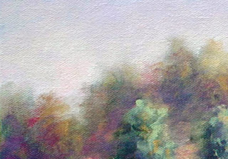
Lets start in the far distance, where trees are tiny. This is where your colors will be neutralized the most. This is where the "snowstorm's effect is heaviest", so everything about these trees will be muted, hazy and filmy. Tree edges should be loose and soft. Nothing hard and defined. Just as the color is muted, so should be your brushstroke.


If your composition has several layers, meaning subjects in varying distances from the viewer, such as background, middle ground and foreground. Make each layer gradually come into focus. Your colors should remain neutralized to a certain degree until you reach the foreground. Once you have already painted the background in very muted shades, you can add pigment to the remaining paint on your palette. So a very neutralized background yellow can be altered for the middle ground by simply adding more yellow pigment to it. Since the original mixture was already neutralized, there is no need to neutralize it again. By adding yellow, it will become less neutralized than the original and therefore it will be brighter and leap forward, by contrast.

Objects that are less neutralized will separate visually from those that are more neutralized.

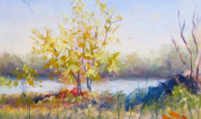
Take another look at the top photo. The treetops from the middle ground read closer to us, even though we only see a small portion of them. No perspective lines are present. It is the varying degree of neutralization that causes this effect.

Your color saturation increases as it moves forward on your canvas and focus more defined on your objects. More detail is revealed in the middle ground, but edges are still a bit soft.

As we continue to the foreground, our colors become pure and not neutralized.


It is here we find the most detail. The "snowstorm" has few particles in our way. Colors are saturated. Darks are deep. Contrasts are sharp and edges are crisp.
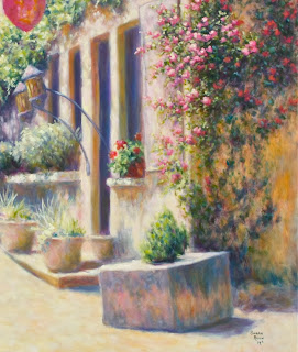
When painting an open field or a vast ocean, make sure you neutralize the farthest portion and increase the amount of pigment, as you move forward. If your experiencing the problem of your field or ocean wanting to "stand-up", simply neutralize the distance and watch it lie down!

If you want an object to separate from another, don't overwork it until it turns to "mud". Take the object that is behind and neutralize its edge that is touching the forward one. This can be very helpful if painting a bouquet of flowers. At times merging objects is poetic and beautiful, but if separation is wanted, neutralization will achieve it every time.

This is also a useful tool for painting plein air on a sunny day. All the colors will appear so bright to you. Nothing will look hazy or muted. But do remember to neutralize your distance and your results will improve.

If its in the distance, neutralize!

Red, yellow and blue. The three primaries... Of course you could also neutralize by simply adding payne,s gray to everything, but please don't. Your painting will suffer from it. Red, yellow and blue. Its the ticket.

Please note that this is only a lesson on creating distance with neutralized color. Art is creative and there are many exceptions to every rule. This lesson is merely a tool. A tool that can help you define one layer from another while still achieving depth and a feeling of reality. This does not address the "focal point". Aside from everything I've written, the focal point holds the sharpest edge and the most contrast in your painting. It could be as little as a small stroke. A special small stroke to pull the viewers eye there. A juicy dot of color perhaps. Something that stands out above everything else you painted on your canvas. Also another lesson...

Some artists such as Richard Schmid will purposefully mute the foreground to hop the viewer directly to the middle ground. Time and time again you will see this technique used. There is nothing wrong with doing this. It is quite captivating. But please do note that though they are drawing you to the center of the canvas, the objects in the distance are muted...

If you want to show distance, neutralize!

Friday, April 16, 2010

Neutralize


Golden Warmth
Original oil painting 14x18" (sold)
by Susan Roux


Neutralizing color.

Its so important in painting. Its so simple to do. But I think its one of the aspects of painting that is not clearly understood by all. I also think its a lesson that can greatly improve art.

Its the magic tool to create depth on your canvas.

Yes, I know perspective lines create the illusion of depth. But what if there are no structures with receding lines in your painting? Its often the case with landscapes, even still life's. What then? How do you show distance? There is more than size reduction available as your tools.

I teach to beginners. I mean people who have never painted before and don't know how to draw. In 8 two-hour sessions I get them to complete a painting that totally surprises them. There is depth, contrast, unity in color, a captivating composition and a clear focal point. They are so excited about their achievement that most continue on as my students. How do I get them to achieve all this when they've never done or studied anything about art? Neutralizing color.

I will explain it to you as simply as I explain it to them.

Particles in the air. Lots and lots of particles exist in the air. Moisture, dust and who knows what else. We've all seen it. That ray of sunshine that flows in the house with all that "stuff" hovering in it. Can my house be that dusty??? Its everywhere, though we can't usually see it. Now imagine a snowstorm. (In Maine, this analogy works very well...) When its snowing lightly, you can see across the street, but everything looks muted, hazy, filmy. Not like a nice clear view. If its snowing very hard, you can't even see across the street. Why? Its due to all the snowflakes obstructing the view, right? Yes. (For those of you in sunny Florida, you'll have to use your imagination...) Particles in the air do the same thing.

They obstruct the view. The farther something is from us, the more the view is obstructed. This causes every aspect of it to become muted, hazy, filmy. This relates to its color, its detail (usually lack there-of) and its form.

We are all aware that mountains in the distance appear blue, gray, even purple... But what about something across the street? In painting, neutralizing color in various degrees will show distance every time.

Its the most repeated phrase in my teaching. "If something is in the distance, what do we do? Neutralize color!"

Here's the secret formula. Better take out your pen, because its very complicated...

Every color can be neutralized. All that is needed is all three primary colors together. Red, yellow and blue.

When mixed equally, your paint will turn gray. When mixed with one prominent color, it will continue to hold the property of that color, but it will dull out. If you mix the color you want, say "green". Stop and think which primaries are already present. Blue and yellow. The red component is missing. So any "red" on your palette, be it alizarine, cadmium, magenta, purple etc. can be added in small quantity to your green to neutralize it.

There's no need for a complicated color wheel with primary colors, complimentary colors and everything else to confuse you. Just the understanding of needing all three primaries. Red, yellow and blue.

It works for every color. Just mix the color you desire first and then add what is missing. If you want a soft yellow, then mix your desired shade and afterwards add a very small amount of red and blue. If your dealing with light shades, pastel shades, you may find it easier to create pastel versions of both your red and blue before adding them in. (You can make a pale lavender to use...) If your soft yellow neutralizes to gray, simply add more yellow until it pulls back to the yellow property. With time neutralizing, with the correct amount of added primaries, will become easier.

Tomorrow I'll explain how to get neutralized color to work for you. How to implement it into your paintings for optimal impact. Be ready to see instant improvement if you're not already utilizing the wonderful tool of neutralized color.

Happy painting everyone!

Wednesday, April 14, 2010

Warm soil


The sun shines and the green carpet is laid outside my front door. The lawn is nearing its first "mow" of the season. How lush and inviting it is.

Creativity surges through my veins. It bubbles and excites. The yellow daffodils radiate tall above the dense patches of blue snow glories. Large tulip buttons rise and await their turn for center stage. Such beauty. The colors of the garden intermingle like the colors of a painting. Spring is calling. Its calling me out. I want to go play in the dirt...

Its a great time to rearrange perennials. As they pop out of the ground, memories of last summer's garden flood my mind. The blossoms. The colors. The spectacular dance of changes, as new flowers bloom and others fade. The garden can change color totally in the process. As I watch each new plant emerge from the warm soil, I remember its unique presence and gift to the garden.

Some plants have grown taller than expected and block delicate others. Beautiful, hidden plants should be moved. The excitement of rearranging urges me forward. Its the creativity of the process. Like sculpting an unseen item. The imagination is what leads. Imagining height, color and blooming time. Rearranging is the creation. The outcome is the show. The show of scented color that will continue to come until autumn's frost. But now, frost is far from my mind. Warm sun takes over.

I have many flower gardens. They are all around my home in unusual ameba-shapes that inspire asymmetry. Like wondering, exciting sprawls rising out of the green carpet. They seduce me...

I succumb.

Some plants will be switched to different beds. The shuffle begins. One large spring effort gives way to a summer season of pause and enjoyment, viewed from the pleasure of my garden bench. Sitting there in the afternoon sun, filling my lungs with sweet perfume, makes me thankful for all I've been given in this world. In nature I feel closest to God. What wonderful creations He has made! And he shares it all...

Its good we're sharing our gifts, our talents and our support. It makes God smile down on us. And that's always a good thing...

Tuesday, April 13, 2010

Such a "Dub"...


If there's a fruitcake award, please give it to me quick!

I just wrote this post about my painting problem. As I was writing, I decided to fix it and post the finished version at the bottom. Unfortunately in my haste and a cup of coffee short of awake, I failed to photograph it prior to fixing my problem... So now I have this post written about a painting issue, without a photo to go along with it! Sorry... You may want to stop reading now. I even joked about deleting this post. Maybe I should.


I'm finally back in front of my easel! Being everywhere was fun, but getting back to painting feels like me.

The past two days, I've been working to finish up this painting. I'll be delivering it to the Blue Heron Gallery in Cape Cod, in another week. The pressure is on. Pressure to finish up some lingering canvases. Unfortunately my best work isn't executed under pressure...

As I was painting my figure, I was happy with the results. She appeared very striking. I ended by doing her reflection and deepening the bottom water. My brush danced around in juicy shades of purple and blue. (I just bought three new blues and playing with new mixtures had me overjoyed, like a child with new toys!) The oranges were dynamite and sang among the darks. Playing was fun...

Did I get carried away with my new found colors? Did I fail to see what was happening? Maybe I was just away from the easel for too long? Luka Bloom was singing in my ears and I felt so relaxed and happy. My brush was on automatic... You know that's when your true spirit is releasing itself on the canvas. Your deepest self is being exposed. Revealed. Its the recipe for your best work. So why didn't it work, I wonder???

The bottom overpowers the figure. She no longer seems to capture the attention. She's fighting with the reflection and your eye doesn't know where to go. I stared at her for a long time last night, trying to figure out (no pun intended...) how to fix it. What does it need? When I crop out the bottom, she pops out perfectly.

Such a dilemma...

My thought has been to darken some of the top left. However, my intensions weren't to have a dark painting. I was fighting with myself. What to do? What not to do? Blogging is great, isn't it? As I sit here evaluating it for you, the solution I seek reveals itself. I have also been annoyed by the interrupted bands of white. Did I need to connect them somehow? No. I don't think so. I think my problem lies in the contrast of the reflected skirt with the dark water. Though I think its lovely, its also what's pulling the eye away from the figure. No need to darken the top. By dulling her reflected skirt, it will solve the "white blotch" problem at the same time.

Funny how its so easy for me to see what's needed with my students work, but often difficult with my own. It has to be that passion. That attachment we get with every stroke and color we painted. Ideas we tried to execute. Though failures at times, are hard to abandon. I'm happy to see dulling her skirt is all I need to do...

Knowing that, I could delete this whole post and go fix her quickly. But I think its better as a learning tool to post her as is. (Such a Dub...)

On the bright side, I was very happy with the colors dancing around her feet. She's looking down and I just want to watch her splashing feet too!

(My sincere apologies for botching this up... Its amazing you actually read to the end. Thank you for putting up with my stupidity.) Sometimes we just need to laugh at ourselves...

Posted: "Carefree" Original oil painting, 36x12" painted-edged gallery wrapped canvas by Susan Roux

Thursday, April 8, 2010

Purple


Shaker Orchard
Original oil painting 18x24"
by Susan Roux


When in doubt, use purple.

These words of advice echoed out of my mouth to my students last night. They were received as a wonderful proclamation of wisdom. In all fairness, with the color palette we use, it does hold true.

I love how different artists have their own favorite color. They've learned to incorporate it into every painting. Their ability to manipulate it and make it "sing" reaches beyond others. They've studied it and tried it in every situation. It becomes more like a in-depth study on that particular color. For me its purple.

Dioxazine purple.

I don't have a painting that doesn't include it. Naturally I teach it to all my students. The first time I have them block in a tree with a purple underpainting, I get a lot of strange comments. Purple trees? By the end of the painting, they become lovers of purple as well. They can see its value and appreciate its many uses.

I find it universal. I don't paint with browns. Yellow ochre is the closest brown on my palette. Rather, purple becomes the substitute. Mixed with yellows, it neutralizes. As a dark in greens, it holds such depth and excitement. With blues, well its just real pretty...

So when in doubt, use purple. It works nicely with everything. It gives your painting a shot in the arm. There's a deep richness that it brings to your art. No wonder it was the regal color of kings robes. It holds the property of standing above the rest. Its interesting and noticed, yet can be so understated. Don't underestimate the power of purple!

It belongs in the sky. It belongs in water. It belongs in the trees and in every dark portion of a composition. Once you unleash the power of purple on your canvas, you will have to agree. When in doubt, use purple.

Magenta runs a close second. Though not quite as versatile as purple, it energizes and accompanies it very well. Try some in your trees next time...

So here is my completed painting. The sky has been warmed and the weathervane added. Thanks to Roisin O'Farrell's email telling me it looked finished to her, I took it easy to preserve the feeling I'd already captured. In her words, "I wouldn't touch it. It's charmed the pants off me, just as it is!" Thanks Roisin. Sometimes we need to here it from someone else. STOP!

It felt so good to paint...

Happy painting and have some purple on me today!


Wednesday, April 7, 2010

On the go


Work in progress
by Susan Roux

I just returned from visiting my sister and I leave again on Friday to see my college son, who's turning 21. I am "Susan on the go" these days! I'm here. I'm there. I'm everywhere!

Eventually I'll plant my feet back on the ground, but that may not be until the end of April... Spring is here and I've sprung in all directions!

So please bare with me as I trot around. I'll try to stop in as often as I can...

My paintbrushes miss me. My hands ache to hold them. I haven't painted since my last class, Thursday night. At these moments, thank goodness for painting class. Otherwise I probably wouldn't get to paint at all.

Maybe today I'll indulge in some personal, playful painting time. My spirit could use it... (Plus Mike was such a dear and did all the laundry while I was away! Thanks Babe. You're awesome!) It may have created space for some much needed "Susan-time"...

Do you recognize the painting posted? It changes so much with each painting session. The direction I'm going with it, is also changing. The blue patches of underpainting in the foreground look odd and out of place in this photograph, but they really compliment the painting in real life. I've decided to keep them. Its been a challenge, because trees pass all along the front of the building. I'd planned to paint them in. But now if I want to keep the blue patches, I need to abandon that thought. I spent much time last session trying to decide how I would alter my composition mid-stream. That can be a recipe for disaster!

Tonight we continue.

There's a traditional weathervane that rises above the existing pinnacle of the building. I think its important to the composition. It will help set dominance. Warm light will need to find its way into the sky. Currently we have a warm light/cool light situation happening here. Seeing we only have one sun, the same light that drapes itself on the landscape is also present in the sky. It came as an unpleasant surprise to my students when I announced that we would be returning into our sky's...

Luckily the paintings are all dry. Returning to painted areas need not be scary. Any additional strokes, if unwanted, can be easily removed with the magic eraser, mineral spirits! I have no doubt they'll be able to adjust their sky's to the correct light quite easily.

The thought of painting energizes me.

Happy painting all of you wonderful artists! May you find time in your busy lives to nourish your own spirit. As Spring pops and the temperature warms, let yourself flourish with creativity and color.

I sense amazing works will be popping up everywhere...

Saturday, April 3, 2010

Moon beach


The weather was lovely yesterday, so Mike and I drove to the beach
and landed on the moon...


Well, not really the moon. It just looked like it.


The coast was completely fogged in. The tide was way out and the shapes it left behind were nothing like I've ever experienced. Humps and bumps and crevices as far as the eye could see. Coupled with the lack of detail in the haze, it seemed the perfect setting for a sci-fi movie. It even felt eerie being there...

We could hear the waves crashing, but we couldn't see them. The mysteriousness had us moving forward cautiously. We even turned our heads in slow motion as though fearing what might be creeping behind us...

It was a totally different "beach" experience!

With cameras clicking, we continued on. I kept hoping the sun would burn through the haze. It was obvious it wanted to. At times we could feel warmth on our faces. Little peek-a-boo's of filtered sun lit dots of landscape then disappeared again.


People emerged in and out of the fog.


Sand dunes in Maine... No, wait. Maine doesn't have sand dunes. Cape Cod has sand dunes! The beach had been terribly beaten and broken this past winter. One horrific storm with record high tides swallowed the land. Popham Beach was virtually unrecognizable.


Suddenly, much to my surprise, we came upon purple sand! Its a dream for me. For those of you who don't know me well, I'm a purple freak and here I find purple sand!!! Wow. I was in heaven. How lovely it was. I wanted to take some back with me, but I had nothing to put it in. Why do we go to the beach without a zip-lock bag in our pockets? There are always little treasures we want to gather and take home.


A bit further down the beach, we saw the reason for the purple sand... Trickling from the mainland was a stream of blue and purple carving its way, like the empty branches of a tree, towards the sea. What chemicals are leaching, I wondered? Suddenly the purple sand seemed much less appealing...

We didn't stay there as long as we expected to. Afterwards, Mike and I laughed at the strange experience it was. We did have a nice walk together. Taking photos is one of our great pleasures and Mike was just breaking in his new camera. The foggy conditions created a good opportunity for him to try new buttons. Apparently his new baby has plenty of buttons to push and he always claims he's just a button pusher...


Michael McAllister, seconds before getting his feet wet...