Showing posts with label color. Show all posts

Thursday, August 15, 2013

Color Workshop


Burning Through the Fog
Original oil painting  24x36"
by Susan Roux


This is for all of you spontaneous artists out there.

I was approached by an out-of-state artist who requested I teach a workshop at the end of this month. I've decided to honor her request. Most slots filled quickly by my current students, but there remains a few slots open. It will be an intimate/friendly workshop, held in Poland, Maine. Bring your oil paints and your sense of humor!

The focus is on color. Understanding color and using it creatively to aid in capturing your emotional response to your subject. I won't try to change your painting style, just arm you with new color-usage tools. Capture form while using color creatively. We will work with a series of exercises, a painting demo and time for artists to practice what they've learned while I assist everyone with helpful instructions. My students who took this workshop last year improved in leaps and bounds. It was so visible to all those students who hadn't participated that those who had were approaching painting with a new found fearlessness to color that translated into beautiful work. I'm positive I can help you move forward in your own artistic journey. What do you have to loose?


Dates: August 26, 27, 28. Monday, Tuesday, Wednesday.

Time: 9-4

Location: Poland, Maine

Bargain price: $100. for 3 days

Contact me if you're spontaneous and interested.


Saturday, June 1, 2013

Color vs Value


Ahoy Maties
Original oil painting  24x18"
by Susan Roux


Color and Value. They're quite different.

Color, we all know. It's how we've been taught to refer to the pigment of everything we see. It's green, it's blue, it's yellow, it's red... Of course as artists we know there is a lot more to color than just identifying it's pigment. We train our eyes to see beyond mere childlike identifications. Is the color neutralized? Is it saturated? Has it been lightened or perhaps darkened? Is the color in sunlight or in shadow? This is where it can get tricky.

As soon as we start thinking in terms of how light or dark the color is, we switch to talking about it's value as opposed to it's pigment. Here lies a very confusing fine line for a lot of people. My students stumble on it a lot. Value becomes confused with color.

It's pretty easy to do since we are always using color to paint our paintings. Whether we're depicting value or color, it's with mixtures of color that we work with. Even trying to write it feels like a tongue twister.


The most important thing to capture in representational painting is the correct value. How light or dark a passage is. It's what identifies form. Three values, a light, a dark and a mid-tone placed between the two will create the illusion of 3-D form. As for color, the skies the limit!

Unlike needing the correct value, color can be as expressive as the artist chooses. So long as the value is right in a passage, any pigment can be used. The decision is up to the artist. Some will opt for a close representation of what they see while others will play with the emotional factor color possesses.

I experimented once and painted an entire painting with very wrong colors, but kept the values correct. It was pretty bizarre to look at, yet when you looked at it through a red-sheet value finder, it appeared to be totally correct. A friend said it would make a great exhibition. Paint all these crazy paintings and have value finder glasses for viewers to use. I could actually picture it in large cities, but never followed up with the idea from my rural area.

Do you have a red value finder? I like to pass some around during my first class with beginner students. It blocks out color and helps you focus on the actual values. As I try to have them look at things in terms of value, it's a great tool. Squinting does a similar thing and I'm sure a lot of you are accustomed to doing so as you paint.


 Are you getting your values right? An easy way to check is to turn your image to black and white. Eliminate the color and what remains are the values. Does your work hold up to this test? If not, try focusing on it and you'll find your work will improve. Your images will become stronger. Getting the values right is primo in representational painting.

-----------------------

Ha ha. I have to laugh at myself. It's wasn't until I was sitting here looking at my image in black and white that I noticed the reflection doesn't line up with her right leg. I moved her leg to the left near the end as an adjustment, but never moved the reflection! I guess she needs to come sit on my easel a bit longer...

See. There's proof that turning your painting to black and white can help you improve your work!


Monday, April 1, 2013

International Fine Art Gallery


Uniting the world through art


How do you like our sign design so far? Our round logo will fit nicely in the empty space beneath the word Gallery. It's all coming together. Just as the sign design develops, so does the entire vision. It's so fascinating to watch the individual parts begin to fall into place. It's very similar to how a painting comes together. Having a general idea and building upon it by responding to everything else you've already done, while keeping the final goal in mind.

I'm a colorist. I teach and promote the use of creative color. Color can be a crazy thing. Each has its own mood and by combining them differently, the artist can infuse different emotions into their work. 

We are also affected by the colors around us. 

I laugh sometimes as my students create paintings that would fit wonderfully in my home. Every color around them, though they don't even realize it, affects the color choices they make. Even those colors way off in their peripheral vision. 

I like to use this concept as an advantage. In the initial block in, I encourage wild freedom of color. Grab whatever color you feel like dipping your brush into. It's just the underpainting and most of it will be covered again anyway. Nothing too scary about that.

Some students are more daring than others. I really discourage beginning with local color (the color we perceive things to be. The leaves are green, the sky is blue...). Those students that begin with the funnest colors create the most energetic and emotionally filled paintings. As the students take breaks and view each others work, the more conservative ones ooh and aah over the wild colored ones. Why? Because the creative use of color infuses emotion.

Those initial colors keep affecting the color choices we make. Just as color around us affects our painting, so do the colors staring bluntly at us from our canvas. This is an important point that I cannot accentuate enough. An emotion you set early on in the process will strive to carry through until the end. As I tell my students, if you begin to paint something with local color, you have no place to go with it. Adding green to something that is already green is not exciting. Adding green to something that is purple, magenta, blue or red creates energy and excitement. That energy translates back to you as the artist. The funner your painting is, the more you wish to continue painting. Like a good book you can't put down.

How many times have you lost steam while working on a painting? Perhaps you had imagined it more exciting than what was reflecting back at you. Grab some color! Have some fun! You'll like it better in no time.

I'm following this concept as I put together ideas for the gallery. Every time I begin to get too bogged down with the more serious business side of things, I throw in something creative. By keeping it colorful and exciting it reflects back a wonderful energy that makes the continued journey forward easier and fun.

Art has it's difficult side too. Focusing to improve can hurt your head. If you can remember to keep it interesting and fun, the journey and the outcome will always be more exciting.


Thank you for stopping by and leaving your wonderful comments. You really make my day!


Note: Roux & Cyr  (pronounced Roo & Sear)


Sunday, September 16, 2012

Personality of color


Potted Petunias
Original oil painting  16x20"
by Susan Roux

Do you have a favorite blue? How about yellow?  

Do you have a favorite color in general? Which color couldn't you give up?

I don't know if I could answer any of these questions. I can tell you some colors I don't like. I can tell you some colors that I love to work together. But a favorite? Oh I love color way too much to pinpoint one as a favorite.

My palette started off fairly simple with 7 colors and white. It was my standard and I used it quite successfully for many years. I still teach it to my beginners. As time went on and my journey sent me exploring richer, fuller colors, I began rummaging the color charts. 

I purchased a few random ones, usually to help capture certain flowers I was struggling with. I think you can all identify with that. No matter what subject you're painting there's often a color present that you have difficulty capturing, so a tube close to the pigment becomes of great use to you. 

My purchases evolved in time. I became fixated on certain color families. I remember beginning with yellow. I bought a whole range of yellows. I didn't go crazy with them all at once. The tubes sat nicely available to me. One by one they got promoted to my palette as I saw necessary. It was a good way to get accustomed to them. I think had I put them all on my palette at once, I would have been overwhelmed. 

This way I learned each one individually. I learned how to work them with my existing colors in a way that harmonized with what I was already doing. I played. Mixing them with each color on the palette to see what little surprise they held. 

You'd be amazed how much I learned doing this. 

I don't squirt all my yellows on the palette at once. I've learned how they can assist me. It's a good feeling to have them at my fingertips and be able to go directly to the right one that will capture what I desire. That said, I don't think I ever use a color directly from the tube. It always gets to play with a friend first.

I did the same with blues. I must have at least 7 blues to choose from. Yes there are the old standbys that always have a permanent spot on the palette. Colors that get mixed into other colors no matter what I'm painting. But how about when I'm painting something blue? The sky, water, or beautiful blue blossoms? Having such a selection at my fingertips is priceless. 

In my quest for complex color, this has been a blessing.

Don't be afraid of color my friends. It's the best tool we've got. 

One of my students keeps remarking on the blues in my paintings lately. How do you get those wonderful blues? 

The answer is simple. Have a variety to play with, mixing them with other colors in your painting and soon you'll have a wonderful array of shades that visually dance together. The trick is to get to know each new addition. Think of them having their own personality. Once you understand them, they can be very useful to you.

I have many friends. Lots of personalities... Sometimes I choose to introduce some to each other, but I'm careful to pick the right blend for the right situation. If I have a boisterous friend I might not invite her to lunch with a quiet, somewhat introverted guest. On the other hand, she might be the perfect invitee at an art opening. Who better than to talk up your work? 

The same is true with your colors. If you're working in a sea of pastels, you might not want to use a really loud pigment with it, or be cautious to add in very small doses. Some personalities just go better together...

Have fun and good luck! 

So what's your favorite color again? What personality would you say it has?


Tuesday, May 22, 2012

Flower Islands


Foxglove
Original oil painting  18x14"
by Susan Roux

I made the last of my deliveries yesterday. Three sets of art to three different galleries. The day was picture perfect for a coastal delivery. The three hour drive to Blue Hill takes me through winding country roads eventually connecting north on Route 1. For those of you not familiar with this route, it begins in Florida and follows the coast all the way up to Maine. It's a lovely drive during off season, but can be a traffic nightmare at tourist time. Quaint shops with interesting names and creative signs stimulate my artistic juices. Even without stopping, reading the names and seeing original looking store fronts sends my mind dreaming. Interspersed are glimpses of the ocean always with islands jutting out and keeping the seascape interesting. I didn't think I'd be doing much plein air this year, but yesterday's drive awoke the desire.


I stopped at a roadside garden shop. Color was overflowing! Did you know I have Monet syndrome? Not only do I love painting flowers, I keep creating more and more gardens around the house! I've been mixing annuals with perennials and the changing color show throughout the summer is the perfect haven for an artist to relax in. My burst of work is in the spring and with summer-like weather, planting is earlier than usual. There's a great rush of anticipation as I design my gardens. Like adding color to a canvas, I imagine which plants will be blooming together. It's like painting blindly. As the shapes grow, shadows are created and with it possibilities for wonderful compositions!


I bought a few colorful annuals to place in unusual planters. I've been designing a new outdoor seating area with a great view of sunset. All my flower beds have curves, most being ameba shaped. I don't like straight edges in my landscape. I'm finding the negative space (lawn) as interesting and important as the flower beds themselves. When I think of the various shapes I've established, I'm reminded of all the islands making Maine's waterfront so spectacular. As you drive by, one island seems to be moving in front of another. It makes those rock hard planters covered in evergreens come to life! And so it is with my island flower beds. As you walk around, the flowers from one bed seem to move in front of another. I've always been attracted to that illusion of motion. I find it interesting that without consciously thinking about it, it's how I've designed my surroundings. 


Everything is a composition. Colors, shadows and splashes of light. Whether painting or planting the journey is similar and the passion is present.

Do you have Monet syndrome too? Have you created flower islands? As an artist, where do you go to unwind?


Note: Foxglove was a little corner garden on Deer Isle. I painted it with one of my classes. It was included in the body of work I delivered to Blue Hill Bay Gallery. If you come to Maine this summer, it's a beautiful artsy coastal town to visit, only 30 minutes south of Bar Harbor. Do stop in and say hi to Peter.


Saturday, November 5, 2011

Playing with color


Caressing
Original oil painting   20x16"
by Susan Roux

Last post I mentioned color is emotion. 

It isn't just a loose statement I've put out there in cyberspace. I experiment a lot with color and know it to be true. I can play for hours entertaining myself with color.

I'm not in a rush when I paint. Every canvas has turned into a learning playground. Don't misunderstand me. There are certainly times of major frustration. Major, MAJOR! But I like to take my time to watch what happens when I change things. Change things such as colors.

Emotion.

It's the greatest change that takes place as I alter the colors on a painting. 

These pretend backgrounds I place my beach girls in have offered an opportunity to cut loose and scribble color. Layers and layers of color get placed there every time I'm tense from focusing too severely on my girl. It's created a yin-yang for me. High intensity on capturing my figure versus complete release on the remainder of the canvas. I like painting large. Many of my girls sit on 28x22" canvases. That leaves a lot of empty space to scribble color! Believe me, I need the release...

Color doesn't scare me. I enjoy manipulating it, changing it and frankly I just embrace it. I think it's my favorite part of painting. If I had to move to black and white, I'd probably give up painting. It's at my very core. No wonder I spend so many working hours being entertained by it. 

If you're a little nervous about color, one easy principle comes to mind. Combine the primary colors (any red, blue or yellow) and the result is a grayed, neutralized pigment. Upon that neutral, any clean color will stand out. This basic knowledge frees me to play as much as I desire. If all fails, the result is a neutral tone. Any color can be added on top and stand out. 

In other words, play with too many colors on canvas and they dull. Some of you call it mud. This grayed base provides a perfect surface to place pure pigment. This concept keeps me fearless with regard to color. There always exists the opportunity to work pure pigment into a neutral area. 

I played with the background pigments of Caressing a lot. The mood and emotion of this painting changed as I altered the colors. In the end I emphasized those pigments that presented the emotion I preferred. The magenta's set off her sunlit back. The golden hues added warmth and sunlight to the water and the greens added a stable base anchoring the composition. The background became a mixture of secondary colors (green, purple and orange). 

Something has really grabbed me while painting these figures. I began in January of this year and continue to be amazed and challenged. All the while having a fun release in playing with colors on this simplified stage, a single figure in a vague atmospheric presence. As I focus on sun and shadow patterns falling on the figure, I also have been enjoying playing with (and learning) color.

What's your secret passion in your whole creative painting journey?


Saturday, July 30, 2011

Nicolaides words


Fetch
Original oil painting 18x24"
by Susan Roux

After dozens of suggestions from Don to buy Nicolaides, The Natural Way to Draw, I finally own a copy. I haven't posted for awhile because I've been toiling over this painting. Do you ever do that? Toil? I have grunts and groans, huffs and puffs of exasperation that pour uncontrollably from my body. I throw my brush down, take a few steps, turn to look at my work through a mirror, exhale deeply with thrust and return to do another stroke. The level of concentration is so great that each stroke seems a massive effort. In the beginning of Nicolaides book, I read a new word to describe this. Painstakingly.


It describes my efforts to a T. It's miles away from having "fun" on canvas. It's deep and concentrated and a place I don't always get to while painting. It renders with precision and every now and then, I find it necessary for what I'm trying to achieve. In this particular case his sweatshirt became the challenge. I wanted it to read oversized. My fear was making him just look fat.

The secret was in the folds. Nail the folds and it will look correct. So I spent hours and hours and days and days on those folds. Long days.


I was pretty content with the results. I know these images are inferior as usual and some of the values and transitions are incorrect. But still, I feel I captured so much extra space in his sweatshirt that you could almost crawl right into it with him. Painstakingly. Yeah, good word.

Nicolaides had another word to describe a painting method. Ferociously.


Now doesn't that conjure up a great image for you? He ferociously put paint to canvas. The release expressed in that sentence is massive. It reminds me of my initial block in. Some parts go on slower, but I definitely have moments of ferocious strokes. Spontaneity and determined force are things I associate with that. I often call it scribbling with paint. My backgrounds certainly fall into that category. This is where I'm in fear of having too much fun on canvas. Sometimes it's tempting to call a painting finished after ferociously blocking it in. It's full of freshness and personal emotion. It's easy to feel connected to it, but rarely my best work.

The biggest challenge I had with this painting was trying to keep enough spontaneous looking strokes to achieve movement. The tightness of the folds made this difficult. I found myself softening them a bit in the end. I felt I had to overcompensate by making my loose strokes extra loose, otherwise it all looked too stiff.


There lies a balance in there somewhere. I know I have a lot to learn before perfecting it. Maybe it never gets perfected. A juggling of the right amount of painstakingly and ferociously applied strokes. The yin and yang of art. Balance. Rhythm. A poetry of color...

The journey continues.

Saturday, July 16, 2011

Critique, yes or no?


Lupines in the Sky
Work in progress
10x30" gallery wrap
by Susan Roux


Where do you stand on the subject of critique?

My last post showed a painting before a critique and where I pushed it following a critique. A good critique is priceless, in my opinion. I wish I had one for every painting I paint. I find it elevates my work to new heights. It keeps me pushing, trying to achieve something beyond where I previously stopped. Just last night Mike and I were discussing this and he wished he had to a good photographer friend who could give him a good critique.

Odd thing is, as much as we would like to be continually critiqued, there are many who are opposed to it. It takes a tough skin to listen to your creative work be interpreted by another. We become tied and connected to the things we create.

It's a reflection of ourselves. Who has the right to tell us what's wrong with it?

Rejection in any form is difficult. It can knock the wind right out of you. But I don't think of a good critique as a rejection. Quite the contrary. When someone takes the time to analyze a work they usually already have an attraction to it. The critique isn't designed to crush an artist, but to urge him (her) to think of it in different terms and possibly see it differently as well. We get very close to our work. Especially those of us who work a painting for an extended period of time. So much of ourselves is invested in it.

Though just as love is blind, so often is the artist who has a certain goal in mind. We'll set parameters for ourselves. Things like a limited palette or brushstroke edges. Some soft, some hard, some blurred, some bold and distinct. We can focus so hard on certain aspects of our work, that we'll easily miss other things. Things we already know. They slip from memory temporarily. A good critique allows you to retain what you've captured and helps you push it to an even stronger finish.

Imagine all the paintings you've ever painted. If you could take the best things from them and put it all together in one work of art, wouldn't that be wonderful? This is the critique to me. No one is teaching you how to paint it, only allowing you the insight to add a bit more and turn your work into a wow. It's never about repainting the entire painting (though Don's sent me to do that a few times as well...). It's about taking what you have and adjusting it. It might be defining something or dulling something. Perhaps adding a punch of color or contrast.

There exists a fear of loosing what we've already captured and ruining it. Loosing that look of freshness. Getting it overworked. But returning to a painting for adjustments needn't be done with your largest brushes. Often tweaking with something tiny that can be blended with the existing work will do the trick.

The other factor that comes up in conversation is the qualifications of the one critiquing.

Yes, I'm very fortunate to have Don Hatfield as my mentor and critique-er. (I can make up words, right?) Yes, he is highly qualified. But often the gut instinct of someone not highly qualified can be as helpful. Your kids can be very honest. Painfully so sometimes when they don't get what this part is. Even after you explain it to them and they tell you well it doesn't look like that.

You'd be surprised how many people can give you a good critique. Many of us have the knowledge, it's getting it on canvas that's the challenge!

So where do you stand on critique? Is it a gift or an insult?

Monday, July 4, 2011

Heart vs Fundamentals


Lupines at Dusk
Original oil painting 10x20"
by Susan Roux

Creating art can be a nagging series of conflicts. There exists a fine line between painting from the heart and adhering to the fundamentals. How much of one is too much? Painting from the heart is freeing and spontaneous. Letting go. The brush dips in color and impulse and the canvas dictate what color is next. You feel your creativity bubbling out of you and great joy is experienced in the process. If that's all you do, where do you end up?

Is there such a thing as having too much fun painting?

The fundamentals, those pesky rules, pull it all together. The values define shapes. Design and composition lead the eye. Sun and shadow patterns contribute to the illusion of reality. A wise man told me an artist is allowed only a small portion of fun to be visible per painting. Oh shucks, really?

Here is me painting from the heart. I was captivated by the lupines on Monhegan. I loved the way they danced in the sky. I photographed a lot of them, but the feeling of observing them could not be replicated in an image. I wanted to portray them at dusk. Those wonderful lupine shades were transformed during golden hour. How rich and warm the cool blue's, pink's and purple's became. I concentrated on capturing that. My photo references were poor suggestions, so imagination took over.

Once I finally captured the light I was after, I felt the painting was complete. Funny how if you toss in one crazy element you're unstable with, everything you're grounded on slips from memory. A well advised critique put it all back into perspective for me. Too much heart and not enough fundamentals. Form became sacrificed au lieu de couleur.

I returned to the painting, freed from focusing only on color and began to establish form. Somewhere between heart and fundamentals one can strike a balance that satisfies. Satisfies the viewer, satisfies the artist. After all, if the passage is not defined well enough, the viewer misses the message...


Saturday, April 16, 2011

Simplifying fundamentals


Jennifer's Road (sold)
Original oil painting 14x18"
by Susan Roux

As you probably know, I teach a beginners oil painting class. It's always a challenge to take someone who hasn't painted, often doesn't even draw, and in eight 2-hour sessions get them to paint something they are amazed they produced. Many students are so elated they continue to take classes beyond the initial 8 weeks.

How do I get them to do this?

I begin with a series of exercises. It gives them time to get used to the tools of the trade, mix color, blend color and it also gives us an introduction to the words of our craft. A new language emerges and with it a new way of looking at things. By week two they come to class hyped up and energized telling me of all the colors they noticed in the world that they never saw before. It's almost hard to keep them down in their seats to continue with the day's task. It's like giving sight to someone for the first time. They are overwhelmed at all they've been missing over the years.

Rather than just tell you how amazing my students are, I decided to show you. The above painting is my demo. During five of the eight sessions we work on one painting. I go through step by step along with them, explaining the why behind what we are doing. That way a student learns how to paint rather than just copy what I'm showing them. I love to let students explore on their own, emphasizing that impulse shouldn't be ignored. If you feel like dipping your brush in red, then by all means do it!

Art is a journey in creativity. We all know that. But without knowledge of fundamentals, it can be a frustrating journey. I work very hard with my students to explain in simple terms the necessary elements that will help them achieve what they seek. In landscapes there exists distance. Not only on the land but also in the sky. Turning that 2-demential canvas into a seemingly 3-demential space is a powerful tool.

This is the achievement of a beginner student. Look at the depth, the sun and shadow play and the textures she achieved! A beginner during ten hours of class time. Isn't that incredible?

I've often been asked why I give such a complicated scene to a beginner. Just getting the perspective on this curved road can be a full session to someone who can't draw. I'm not sure why I pick complicated scenes. Maybe I like the challenge. Maybe I know I can pull them through it. Oh, how I love to amaze them by exposing their ability! Simplify, simplify, simplify. The simpler I can explain something, the easier it is for them to achieve it.

When I first hand my students the image we'll be painting, I can see the look on their faces thinking there's no way I can paint this! But by final class, all of the students rejoice at the sight of their work. (To be fair, her photo is quite inferior and the richness in color isn't apparent.) Not only are they able to paint the scene from the lesson, they often surprise me with works they attempt on their own.

Kasey sent me this image. She started it part way through her 8 sessions and completed it afterwards. She spoke of it, but never brought it into class. Just look at the distance she created in her river scene! And to think she's just beginning to paint...

I'm very proud of you Kasey.

I don't have photos from the other students in the class, but if I did their work would amaze you too. Teaching the fundamentals in simplified form has yielded phenomenal results, even in pure beginners.

How are your fundamentals? Are you in need of understanding them in simple form?

Wednesday, March 23, 2011

The endless journey


Warm Breeze
Original oil painting 20x16"
by Susan Roux

An artists journey is an interesting one to say the least. As we progress down the many winding roads of this journey, we come to realize that the end of the journey only exists if we choose to stop. Otherwise the journey is endless. Meaning that the more we know, the more we discover or are educated about art, the more we realize that there is still further to go. I don't care how masterful an artist may be, there is always more to learn.

I've been very fortunate this past year. I've seen my art evolve through experimentation and hard work. For those of you who follow me, you also know this improvement is due in large part to Don Hatfield. He has been a constant who keeps me focused and stimulated by opening my eyes to things I hadn't yet observed on my own.

If you can't see it, you can't paint it.

I repeat this phrase over and over. I feel a vision needs to exist, whether in our minds or through our eyes. Until you observe the light and the shadow, you cannot paint the light and the shadow. The same is true for all aspects of painting. If you can't see it or don't have the ability to break down what it is exactly that you're observing, it is impossible to replicate it in paint.

I'm not just referring to the representation of objects in one's work. I'm also referring to the emotion an artist has towards these objects. In fine art, it isn't simply representation that is necessary. It isn't only about a pretty picture. Fine art also captures emotion.

The emotion we capture is created by many factors. Color, brushstroke and values play a huge part. But a vision or understanding of the emotion you wish to portray needs to be present. Without the vision, the idea, it will not happen.

And so it goes... This is the great mystery, the giant labyrinth that we call the artist journey. It's a combined mesh of skill, observation and emotion. The variables are endless making the combination of the parts endless as well. So where are you on this journey?

I ran across an excerpt today by Barry John Raybould in his Virtual Art Academy. It opened my eyes to a level that I've yet to discover. It's perhaps a direction I'll need to focus on if I want to continue improving. But it seems a difficult step, so don't be expecting too much in this direction from me yet... Here is the excerpt.


Old master artists knew how to suggest a lot of detail without actually rendering it. Look closely at any of John Singer Sargent's paintings and you will notice that an elegant dress is no more than a series of abstract brushstrokes. If you make your viewers exercise their own imagination, you stimulate them to contribute their own thoughts and images to the work and become a participant in the experience. If you depict everything to make it look like a photograph, you leave nothing up to the imagination of the viewer. The other big advantage of the principle of suggestion is that once again you can say more with less, simplifying and strengthening the abstract design of your painting.

The abstract he refers to in John Singer Sargent's dresses is more than just a loose stroke. It's also a combination of loose color. Both of these combined creates the abstracts he speaks about that stimulate the viewer's imagination. Phew, do I have your head spinning yet? Mine is.

The endless journey... I wouldn't have it any other way.

Wednesday, January 5, 2011

Design, Part 3


Work in progress
(still not done...) 18x24"
by Susan Roux

Color and value. Those magical tools that keep artists addicted. Make a color change or a value change and you can redirect the viewers eye instantly. How do you keep it all in control?

First of all, don't loose sight of your initial plan. Second, when it comes to color with respect to design, repeat it. Color has the ability to hop the eye from one place to another. To keep your viewer exploring the entire canvas, repeat colors and their eye will bounce around in rhythms.

If you don't get too caught up with local color and build your darks throughout your painting using the same colors, you'll establish a color harmony. Some people like to limit their palette to ensure harmony, but others like myself paint with a palette-full. Either way can work.

With harmony in mind, I worked the rosebush. I used shadow values. This allowed me to take my time establishing where I want sunlight to move across it.


Notice how color was added randomly at this stage. This keeps the eye interested and moving. Even in this close-up, where there isn't information to identify the subject, the eye dances around in varied movements. Had I chose to paint each blossom identically, the eye would quickly tire and the exploration would cease.


Next I began adding sunlight to the blossoms. I took my time, stepping back frequently, making sure to retain variety. So far so good.


It became trickier as I added sunlight to the greenery. The deep rich darks that added contrast to the blossoms were being lost. To bring the painting to completion, close attention to value is necessary. Adjustments need to be made. This is when being able to critique yourself becomes critical. You need to ask yourself, what's wrong and how do I fix it?

The answer isn't always easy to find. The eye will travel to the place of most contrast and the sharpest edge. Unfortunately, as I lost the high contrast around my blossoms, the spot of highest contrast and sharpness became my top window pane. Oh man, what a pain!

So here is my dilemma. I've purposefully kept my blossoms in loose edges to project their softness. Each time I would crisp one too much, I didn't like the stiff feeling it created. Now to keep with my initial idea of the roses being my focal point, I must figure out a way to retain the attention there. I do like the idea of the blossom reaching out to the window. It helps in the exploration of the canvas. As my eye goes to this window, it picks up on the tree shadow and swoops back down to catch the blossoms on the ground.

I thought I was posting a completed painting today, but as I review the many photos I took, its clear to me that my painting lost drama along the way. I've never photographed a series of my work in progress before. It's proving to be a very interesting tool. Also I'm finding that talking about my process is a good learning tool as well. I hope you'll follow along as I push myself for improvement...

Friday, December 31, 2010

Design, Part 2


Work in Progress 18x24"
by Susan Roux


After establishing the lines, blocking in the big shapes was next. Paying attention to what's in light or shadow and blocking it in accordingly will give you a quick visual of your plan. It's sort of like your blueprint for the painting you're creating.

At this point, you've invested very little time and if your design is flawed, things should jump right out at you. Adjustments can be made easily and painlessly now. Look at the sizes of your shapes. Are they varied enough? Are they interesting to look at? Think of your original idea. Is your painting still supporting that? So far so good. I noticed the shadow on the lawn also points to the roses. Though it's good supporting motion, I must caution myself on not directing the viewer too abruptly or the painting will loose interest.

We want the viewer to explore the entire painting, not just one spot. Keep their eye dancing all over, that's the plan.

The big shapes were a bit difficult to completely establish, since the rosebush is airy. I made certain to carry my background shapes beyond where I thought they belonged to allow room for some play with the rose edges.


I began placing my roses with a value darker than its final highlights. I found patterns in sun/shadow play in both the fence and the house. Stepping back helps you identify potential problems before you develop too much detail. Adjustments are always easiest in the early stages. I was focusing primarily on the outer shape of the rosebush, trying to keep it interesting and varied. Stepping back helped me notice a snow storm effect. Before it turns into a blizzard of pink and white, swallowing the entire canvas, adjustments need to be made.

I keep thinking of design throughout the painting process. How is my eye traveling on the canvas? As soon as I put in something that becomes too confusing for my eye to differentiate one thing from another, a caution flag goes up. At any point during the development of your painting, when you've just added something that doesn't support your original idea, it's time for an adjustment.


I made certain to calm the white snowflakes in the background. The further I developed the rosebush, establishing some of its density as a form, the less conflicting my pink and white dots became.

To keep the eye moving, I'm painting in directional strokes as I work my dark values. Notice the repeated movement from upper left to lover right in both the darks in the rosebush and the tree shadows on the house. While this movement in the roses is supporting the focal point, the house shadow is pulling you away from it. It works well because it's creating a new rhythm and a bit of tension. The movement is no longer just pulling you towards the roses as in the original line drawing. Now the eye begins to dance diagonally as well. To prevent the eye from completely going off the canvas on the right, the tree trunk directs you down and small dark strokes in the greenery calmly pull you back towards the center.

Color and value also play an important part in moving the eye around. They are the elements of design that are the most noticed. Unlike the first lines of design that remain stable throughout, color and value continue to be adjusted right to the very end. I'll talk about that in my next post...

Tuesday, December 21, 2010

Cheers!


It's not your ordinary week. I don't think I have to remind you. Reading everyone's posts and finding many of you missing, is just an added reminder that everyone's lives are turned a bit upside down this time of year. I'm no different.

My classes are cancelled for the week.

I hope that doesn't mean my paintbrushes will be too, but one never knows what to expect as Christmas approaches. We suddenly take on additional chores and hopefully with good cheer we celebrate our blessings with people we love.

Thursday, just as class was beginning, am enormous Dick Blick order arrived. I often order for my students and it's kind of like Christmas every time the boxes come rolling in. Several of my students decided to upgrade their paints to the lovely Gamblin's I'm enjoying. What a nice Christmas gift! I can't wait to see how their work will change. When class ended, I looked at my palette full of paint and knew it would shrivel up and dry before finding easel time again. Blick-stamped cases of canvas cluttered my entry. Next thing I knew I was opening various sizes and applying a layer of color.

Oh how fun
it is to paint
on brand new
Blick canvas!

Happy Holidays everyone! Thank you for stopping by and leaving your wonderful comments. They mean so much to me, as do you...

When easel time manifests itself, I'll be ready!

Wednesday, May 5, 2010

Beach House


Beach House
Work in progress 18x24"
by Susan Roux

I received Don Hatfield's new DVD in the mail the other day. Its titled, Fantasy Portraits In the Garden. Mike wanted to watch it with me, so we saved it for that evening. It was already late when we got started, so we planned on only watching about half of it.

That didn't happen.

Though it was early get-up in the morning, we stayed up until nearly midnight finishing it. We just couldn't stop. All night I dreamt of painting. (Don't you just love nights like that?) I thought about Don's method and how it differed from my approach. Completely opposite, actually. He begins with grays and adds color over it. I begin with pure color and gray it out...

Nonetheless, it was fun to experience his process and see how he maneuvers the paint around. I feared I'd be stuck in the mud, if I tried his approach!

I haven't been painting, as you well know. Gardening has consumed my every free moment. My body has been absorbing the gifts of nature and as I predicted, at some point I would want to explode on canvas. The following morning, soon after getting Jesse off to school, I was down in my studio. Between Don's instructional movie and dreaming all night about painting, I couldn't wait to pick up my brush!

It was 8:30. I was so inspired. Paint flowed readily from my palette to my canvas. (Yes, Luka was serenading me through my nano...) It was one of those moments when you get to do exactly what you wish to do. I felt happy and blessed and the paint wanted to sing! I didn't even try to paint like Don. Pure color. Saturated color. Nice, juicy, delicious creamy oils hit the canvas as bright light. Each stroke invigorated me even more.

Its close to heaven, when your muse is fired up and moving through you!

I poured all I had into this canvas. I felt myself exhausted. I stopped for a break. It was now 9:30. How could only one hour have passed? It didn't make sense.

Have you ever poured so much of yourself that exhaustion hits so soon?

I knew I must pace myself. I returned after a short break. I didn't want to stop. I worked for two hours more and the painting sits at this stage. I'm not sure if I'll get back to it today. Commitments fill my moments. Perhaps I will find some time...

I was really loving working wet in wet. I hope it doesn't set too soon... My mind continually analyses where I'm at and where I want to go. These forced breaks in painting time can sometimes be a blessing in disguise. It gives you time to reflect on the work you're done and hopefully allow you to see those passages you want to preserve. Overworking the canvas is a downfall of many of us, myself included. I see so many values, its hard not to put them all in...

If you haven't seen Don's DVD yet, I highly recommend it. It takes place during a workshop. I really enjoyed seeing the artists work around him. It made me feel like I too was there painting. Funny how we find similarities of ourselves in other artists' work. I found myself wondering how I would have approached this subject if I had been present.

Enjoy your painting time. Let yourself be swept away with delicious color!


Monday, May 3, 2010

Been outdoors...


I've been gardening.

Its one of my other great pleasures. I know I've mentioned that before...

Perennials are my favorites. From bulbs to plants, they begin their colorful show just as the snow melts. Unlike annuals that require warm temperatures, many perennials can tolerate Maine conditions. Yeah! Its only the beginning of May and I have color throughout my yard. We had a mild, early-ending winter and plants are eager to burst into bloom well before their usual debut. Tulips are still blooming and typical June flowers have large buds ready to pop!

I can't stop myself from going outside.

Everything has come early. The leaves, the grass, the birds, the warm temperatures and yes, even the bugs!


There are plants like Russian Sage and Lavender that I've wanted in my garden for awhile now. Size is a factor. I have little room left for such large plants. My solution has been to make a new garden. So lately I've been removing grass and adding compost to create a bed for these desired "purple" beauties.

I must say, we use different muscles doing this work than when we paint...

My body screams at me in the morning, but it isn't enough to stop me. My love for nature and color extends pass the easel. For me, imagining which flowers will bloom together and placing them so the colors and size will compliment each other is very similar to painting. The biggest difference being that I have to wait to see the results. Little green tufts, that will later bloom in color, or tiny bulbs are like my paints. Place each at a special spot and the result will be beautiful. My imagination peeks and I'm swept away with this more physical type of creation.


The work is plentiful in the spring. Its easiest to move plants around at this time. Spring rains and the lack of scorching temperatures help ease the transplants into their new locations. Every year the show, the completed canvas, is different. Soon my heavy work will be done. The remainder of the season is devoted to enjoying the creation in its constant performance. As one color fades a new one replaces it, like an ongoing dance titillating the eyes.

Later I will bring my easel outside. Somedays I'll paint the floral display. Other times I will paint, like in the studio, but in the beauty of my gardens. I paint best when I'm happy and at peace. In the midst of my flower dance, my creative spirit easily takes flight. All the work I do now is in anticipation of the display later.

Luka Bloom, you know the Irish singer I like so much.., spoke about writing songs. For this creative portion of his work, he requires quiet times of peace and reflection. Its when you can really hear your inner-self, your spirit speak. I feel the same about painting. There are days when its better for me to stop, relax and listen. Haste doesn't benefit my results. To paint nature, its essential that I take time reflecting in it. Quiet time.

So don't worry that I'm not painting. Soon I will be and this quiet, yet physical time, will add to my creative spirit. The more I absorb in, the more I will have to release out!

Don't spend all your time hurrying through life. Make sure you allow yourself quiet times of reflection. They're essential, for many reasons. Just like the buds on my plants ready to explode into blossoms, you will find your creativity ready to explode on canvas!

Marvelous things can happen...


Sunday, April 18, 2010

Neutralize, Part 2


This is a lesson and a continuation of my last post. If you haven't read it, please begin there.

Now that you understand how to neutralize color, lets talk about how to implement it into your art. I'll explain it from the perspective of a landscape, but it holds true for any composition.

First off, your sky isn't usually neutralized. Its your source of light. Clouds on the other hand can often be. The sky is a whole lesson on its own, so let's pretend your sky is painted and its time to paint the other elements in your landscape. Do you start in the distance and work forward? It isn't necessary to work like this, but for this lesson, I'll explain it in this order.

Lets start in the far distance, where trees are tiny. This is where your colors will be neutralized the most. This is where the "snowstorm's effect is heaviest", so everything about these trees will be muted, hazy and filmy. Tree edges should be loose and soft. Nothing hard and defined. Just as the color is muted, so should be your brushstroke.


If your composition has several layers, meaning subjects in varying distances from the viewer, such as background, middle ground and foreground. Make each layer gradually come into focus. Your colors should remain neutralized to a certain degree until you reach the foreground. Once you have already painted the background in very muted shades, you can add pigment to the remaining paint on your palette. So a very neutralized background yellow can be altered for the middle ground by simply adding more yellow pigment to it. Since the original mixture was already neutralized, there is no need to neutralize it again. By adding yellow, it will become less neutralized than the original and therefore it will be brighter and leap forward, by contrast.

Objects that are less neutralized will separate visually from those that are more neutralized.

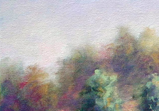
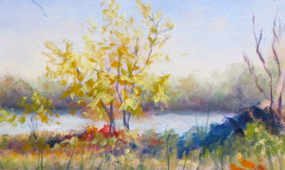
Take another look at the top photo. The treetops from the middle ground read closer to us, even though we only see a small portion of them. No perspective lines are present. It is the varying degree of neutralization that causes this effect.

Your color saturation increases as it moves forward on your canvas and focus more defined on your objects. More detail is revealed in the middle ground, but edges are still a bit soft.

As we continue to the foreground, our colors become pure and not neutralized.


It is here we find the most detail. The "snowstorm" has few particles in our way. Colors are saturated. Darks are deep. Contrasts are sharp and edges are crisp.

When painting an open field or a vast ocean, make sure you neutralize the farthest portion and increase the amount of pigment, as you move forward. If your experiencing the problem of your field or ocean wanting to "stand-up", simply neutralize the distance and watch it lie down!

If you want an object to separate from another, don't overwork it until it turns to "mud". Take the object that is behind and neutralize its edge that is touching the forward one. This can be very helpful if painting a bouquet of flowers. At times merging objects is poetic and beautiful, but if separation is wanted, neutralization will achieve it every time.

This is also a useful tool for painting plein air on a sunny day. All the colors will appear so bright to you. Nothing will look hazy or muted. But do remember to neutralize your distance and your results will improve.

If its in the distance, neutralize!

Red, yellow and blue. The three primaries... Of course you could also neutralize by simply adding payne,s gray to everything, but please don't. Your painting will suffer from it. Red, yellow and blue. Its the ticket.

Please note that this is only a lesson on creating distance with neutralized color. Art is creative and there are many exceptions to every rule. This lesson is merely a tool. A tool that can help you define one layer from another while still achieving depth and a feeling of reality. This does not address the "focal point". Aside from everything I've written, the focal point holds the sharpest edge and the most contrast in your painting. It could be as little as a small stroke. A special small stroke to pull the viewers eye there. A juicy dot of color perhaps. Something that stands out above everything else you painted on your canvas. Also another lesson...

Some artists such as Richard Schmid will purposefully mute the foreground to hop the viewer directly to the middle ground. Time and time again you will see this technique used. There is nothing wrong with doing this. It is quite captivating. But please do note that though they are drawing you to the center of the canvas, the objects in the distance are muted...

If you want to show distance, neutralize!