Monday, August 23, 2010

Lisa


Lisa
Original oil painting 20x16"
by Susan Roux

I painted yesterday...

It seemed like the perfect thing to do on a rainy Sunday. I don't know what happened for everything to go so well, but to my surprise I finished my second portrait! This is my beautiful sister, Lisa. As I was painting her and she really began to emerge, it energized me so much to have her smiling back at me. I just couldn't seem to put my brush down!

I can't quite explain the excitement I felt. Even this morning as I look at my accomplishment, its hard to believe I created this. Don Hatfield is an amazing teacher. I have him to thank for this. If you ever get a chance to take his workshop, don't hesitate. He's hilarious and so gifted. He'll be tough on you and "slay your darling" (which means he paints over your work annihilating all your detail) while still making you laugh. Actually you laugh more when he does it to someone else next to you... But guaranteed, if you go with an open mind and really try to do as he says, you'll really learn. I'm perfect proof. Its been a month and five days since I took his workshop and look how my art has improved!

Can you see me smiling?

My plan is to paint my sister again in this same pose. Don suggested I do as a way to really learn. Seeing she fell into place so quickly, I'm not tired of working on it. I like that this first version feels painterly. I find her fresh with glowing youthful skin and I managed to capture her spirit.

Yeah. Wow! That's what I keep thinking...

How did I do that???

Call Don. Get classes. Paint paintings you won't believe you can do.

Sunday, August 22, 2010

Visiting


Work in progress 20x16"
by Susan Roux

I love how blogging can expose us to so many different techniques. It keeps my mind open and my spirit creatively stimulated. I awoke early this morning and quietly came to my computer with coffee. With volume down, I visited many of you, leaving little comments behind, while still allowing my household to sleep.

Its like finding a friend awake to interact with when no one home is...

I wanted to share one site in particular with you today. I visited and found a demonstration video that really excited me. The looseness and treatment of paint amazed me. It truly was watching the creative process in action.

Its a watercolor demonstration. Every stroke is a direct response of emotion towards what is emerging on paper. There is as much removal of paint with the brush as there is adding paint. It sent me off dreaming and for the first time, I would enjoy trying my hand at it. Oils have always been my love and I never desire to change medium, but after seeing this video, it would be fun to play...

The artist is Fabio Cembranelli. You may have already seen it seeing he has 496 followers! If you haven't, I invite you to stop by. Watching him paint is both lyrical and poetic. You'll walk away feeling happy and inspired.

Posted is my next experimental portrait. I began late yesterday and am approaching it a bit differently this time around. As you can see, I'm just in the initial block-in.

Now take a minute and go click Fabio...


Friday, August 20, 2010

Toby and Leslie


Toby and Leslie
Original oil painting 20x16"
by Susan Roux

I can't tell you the amount of hours I put in this painting. Rest assured I was elated when I laid down my final strokes! I couldn't help but think of Carol Nelson who blogged awhile back, 100 portraits in 100 days. I'm impressed at all of you who post a daily painting. Not only are you completing a painting every day, but also taking time to blog about it. We can't all keep up that pace... Its very admirable that you do. I tip my hat to you.

I had days where I spent every moment from early morning to suppertime planted in front of my easel. My focus was so intense that every time I did this, the following day I needed to rest. It was as though my brain was empty, almost in a haze, and my spirit and energy were drained. I suppose I was really pushing myself...

Wednesday, when all my students saw it nearly done, they were baffled that I wasn't enthused with it. I didn't like the feeling it had. I wanted to capture the sense of love/admiration and all I had managed was the look of porcelain dolls. After I completed the faces, I worked with the background and succeeded a bit in capturing that emotion I wanted. Yes the colors are better in life and the feeling more apparent too.

I learned so much doing this piece. I started off expecting to spend a few days on it as an exercise and move on. As you know, that didn't happen. I hope to capture my next portrait quicker so a bit more of a painterly look will remain. The day I worked on smoothing out my color transitions to soften Leslie's features, is the day the porcelain feeling appeared. There must be a way of painting it soft without turning them to ceramic. My next subject will be a single head.

As I look at it this morning, I am kind of amazed I was able to accomplish this. Suddenly a separation from it, no longer being my lingering job, allows me to have a different perspective. Don, thanks for all your help. Even telling me to start over, though it was the last thing I wanted to hear at the moment.

I may take a few days to go paint in plein air before settling down to a new face....

Toby is my husbands son. He plays guitar in a rising band called Sparks the Rescue. He's toured the country many times and also toured in Europe. Recently they took part in the exhausting Warped Tour, where more than 70 bands played. They have a video that airs on MTV called We Love Like Vampires. You can view it at their official site by clicking their name. Please let me know if your children may have heard of them...

Enjoy your day creatively!

Wednesday, August 18, 2010

Gimp


Original oil Painting 20x16"
by Susan Roux

A quick side note to my last post, Toemailer has informed me of a program called Gimp. I'm not at all familiar with it, but its an image manipulation program that allows you to alter your photos. Gimp is free to download! So thank you Toemailer for letting us know. Many people don't have Photoshop and a free software to fix photos is welcomed and necessary.

Ok, I know there aren't only art blogs out there. But have you ever gone searching out of our little community? I must confess I really haven't. I follow a few writing blogs, but it still falls under the creative arts. I've stumbled over cooking blogs, knitting/sewing blogs and photography blogs. That's about it. So really, what's out there? Have any of you gone to explore?

Toemailer is a blog about toes. Really, go check it out! I kid you not. People send in photos of their bare feet in different locations and it gets posted. Twenty followers thus far. I'm not sure what to think of this. I haven't followed yet, but curiosity just might make me hit that button. Perhaps we should all go follow, all send in photos of our feet, and see how long it takes for them to all get posted???

Sorry, I'm not just strange in the morning. Its an all day thing...

I'm really interested in what's actually out there in blogville. Please leave your comments and tell me some of the most unusual blogs you've found. Maybe leave us a link so we can verify and see for ourselves.


Posted is a scene from Blue Hill, Maine. I've been painting it with my Wednesday night class. I think mine is finished. Class will return with it to put their finishing touches this evening. I haven't decided on a title. This painting will be part of the work to hang at Blue Hill Bay Gallery next year.

Don't forget to leave comments on unusual blogs! Thanks.

Saturday, August 14, 2010

Superimposing images


I've had several request, on and off the blog, asking how to superimpose images. Be aware this is not my expertise, but I'll try to explain it as simply as I can.

Photoshop.

That's the starting point.
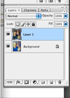
  • First you need to open two images in photoshop. (They won't be together.)
  • Resize them to be the same size.
  • Copy one of them.
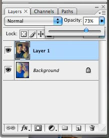
  • Click the other photo and paste your second image in. It should completely cover the other image in a new layer. (Now they're both together.)
  • Slide the opacity bar until you can see both images.

  • The move tool allows you to position them.


Hope this helps...

Friday, August 13, 2010

Utter frustration...


Its been an interesting day, to say the least.

Toby and Leslie are evolving. I added more color to his face and worked hers some. I lightened the background to the left of his ear. That helped. The proportions are still off. If I could make a vertical fold just left of her nose and bend it to reduce the size of her face as it approaches Toby's, I'd be doing pretty good. Unfortunately this is not paper and I can't move the right side closer to the left like that on my canvas.

Here is a superimposed version of the painting and the actual photo I'm working from.


It clearly shows some major problems. When I line Toby's face up she looks like this. When I line her flowing hair up, she looks mostly correct, but he's all askew.

I was advised by the master to begin anew.

Say what?

I'll repeat it. I was advised by the master to begin anew. I did not take to these words lightly. Verbal resistance was my immediate reaction. In the end it all came down to how much I wanted to push myself for the sake of learning. I've never been one to settle for mediocre, so in complete frustration, I grabbed a new canvas and got to work.

I won't put you through the exasperation and groaning I experienced yesterday, but for those of you who heard I never came to blog, this is why. I was very busy in an angry sort of way. Suffice it to say, my attitude wasn't pretty.

Here's the new version. (Yeah, again my colors are off. The camera just doesn't understand what's on my canvas...)


Here's the new painting superimposed with the photograph.


Do I need to say anymore?

Tuesday, August 10, 2010

Experimental mode


Toby and Leslie
Work in progress 20x16"
by Susan Roux

In the words of Celeste Bergin, "Can't wait to see what comes from your new tools."

The answer is: Experimenting! Lots and lots of experimenting.

Family has been kind enough to be my guinea pigs. Many have posed for the camera, knowing they could be my next subject to paint or massacre. Really, its a toss up at this point. If I succeed, they get a portrait. If I don't, nobody gets hurt. Nearly everyone's been willing to participate. Thanks for that.

The double portrait. Little did I know, this held a whole new bunch of challenges. I'm so new at this I thought it would be like doing two portraits on one canvas. No. Not exactly...

Proportions.

Those nasty proportions. They need to coincide for both portraits. You can't just enlarge one head, thinking, oh his chin is a bit lower. Lower his chin and suddenly she needs adjusting too! Yikes.

I had to put more detail than I wanted to on the initial block-in, just to make sure their proportions matched. I find it very hard to tell if my heads are close to correct without adding some resemblance of features. Though my lesson was not to focus on features, rather on planes of the head.


Yesterday I worked on Toby. I captured a likeness, so for that I'm happy. One of my major challenges is with photos of strong light. The face is washed out making various planes void of any color or value change. The other big challenge is again related to the camera. I have great trouble posting what's really on my canvas. If you squint at this image, it'll look closer to what I actually have. The transitions are better than shown. (If you close your eyes completely, it'll look even better!)

Aside from the camera problems, I hope to bring in more exciting color as I continue to paint faces. Yes, it looks like Toby. He's dark where he should be dark and light where he should be. But as for looking exciting and vibrant, a major failure!

I want the focal point to be the point where the faces connect. I think I'll need to lighten the background to the left of Toby's face. Right now, the eye bounces back and forth between the contrast at his ear and the contrast at his eye.

Suffice it to say, this piece is still evolving. I will work on it for awhile and then move to another. That's the beauty of being in experimental mode. No need to work it to death. Do what you can and then move on, trying to improve yourself as you go.

There was another time in my art life that I didn't paint for anyone but myself. Not for galleries, not to make sales, just for me. It made a huge jump in improving my work. That was about a decade ago. It feels good to find myself in this frame of mind again. Though it's very hard work, I feel it will harvest great results.

Don't be afraid to allow yourself some growing time. It can be difficult turning off the commitments or reasons to paint from your brain. But if you can, letting go of everything and experimenting will reward you in many ways.


Sunday, August 8, 2010

New paints and palette


It was time for an upgrade.

Sometimes its wise to realize you've gone as far as you can with the tools you're using. I was there. My paints were student grade, washed down and inferior. I'd grown so accustomed to them, it never dawned on me to change them. But when a wise old man (maybe not so old) visited, necessary changes became instantly obvious.

A bucket full of new paints!

If that doesn't make me want to jump up and paint, nothing will. Big juicy tubes, full of creamy paint, hollering to be squeezed. Its like being a kid again with a new box of crayola crayons!


Better yet is my new place to squeeze them on. Oh, I'm playing with the big boys now... A glass palette. I have to tell you, I'd seem them used before, but never realized the difference it makes mixing your colors.

Its a whole new stimulant!

I'm showing it to you all clean. Really, I should have photographed it in living color. Patches and patches of mixed swirls of paint gradually change with every value and tone at your fingertips. My palette knife rest, if you can believe that. I was so hooked to it before for mixing colors, I'm shocked how easily I've been able to let it go.

So when I tell you I've made some positive changes in an attempt to improve my art, I wasn't kidding. Everything all at once. I've repeated how my head hurts from all the thinking required during these days of experimenting. My brain is in overload. Not just from adjusting to a new way of looking at things, but from working with all new toys.

Would I do it again?

In a heartbeat. I suggest an upgrade to any of you who are serious about your art and wanting to improve your results. I looked at it as an investment in my future. It wasn't cheap, but I'm hoping it will all be worthwhile in time.

I'm currently working on portraits. I hope to secure the lessons of my past workshop by experimenting with similar subjects. Mike's taken photos of family members in strong light so I now have plenty of material to work with. No excuses... I don't know how many I'll decide to paint. I suppose as many as it takes to drill the lessons into my head. Maybe when my brain stops hurting and they get easier to paint, I'll know its time to move on.

At the moment I'm working on a double portrait. It has problems. Hopefully I'll feel comfortable posting it after I resolve some of them...

So when the day is done, my palette gets cleaned. The days used paint is scraped into piles of grays to use tomorrow. And then, one two three, it closes up tight keeping my paints from drying too quickly, into...


A handy dandy, ready to travel, suitcase!


All these changes are helping me from falling back on old habits. There's nothing to fall back on. Everything's been flipped upside down...

Nothing like a whirlwind to propel you into a new direction. Hopefully its forward...


Tuesday, August 3, 2010

Loading Traps


Loading Traps
Original oil painting 16x20"
by Susan Roux

As you know, I've been approaching my art differently since taking Don Hatfield's workshop. I'm overwhelmed at all your lovely comments. So many of you saw my initial block-in as a finished painting. I regret to tell you I put in another 10 hours since then.

Please let me know what you think of the finished piece. Should I have stopped at the initial stage? Your honesty is greatly appreciated. When one is working so hard to develop in a positive way, honest feedback is necessary. Don't worry about hurting my feelings. I'm a tough girl and can take criticism.

Ten hours. I bet you're wondering what I did in ten hours. It blows my mind too.

The first day I painted about three hours. Mike came home, went to look at it and couldn't tell what I worked on. I thought to myself, "Phew, I haven't ruined it yet!"

My brain has been completely involved in this process. I have so much useful information buzzing around in there and I'm trying so hard to implement it into my work. By the end of painting sessions, my head hurts. My only hope for relaxation through this learning process is Luka Bloom piped in my ears, via my nano. Ohhh... how he can serenade me into a peaceful creative place.

So what did I do for ten hours? The block in was to focus on lights and darks. There was no sketch, only a blank canvas and raw paint. Getting the proportions accurate was also of prime importance. The next step was to paint various planes, focusing deeply on the reflected light in the shadows.


You can see all the color in his white shirt and the different planes and colors in his hat. All the while, trying to avoid painting too much detail! I probably failed miserably on that. Paying attention to the planes and avoiding detail seem to be one in the same.


Self criticism: I tried to keep my strokes loose, yet it looks strangely like a photograph. My figure is stronger than any I've ever painted. I had fun playing in the reflected light. I never paid much attention to that before. Of course lots of grays were used and that too was new for me. I'm more of a direct-color person, but I'm seeing the benefits of using grays.

I plan to continue trying to figure this out. In time, my brain will be less active in the process, helping me see myself more in the finished painting. I do find it interesting that with focusing only on light and dark and planes and reflected light can create such a real looking painting. I have loose messy strokes throughout, yet it looks tightly rendered. Of course its worse in this small version. In life, the painting is larger and looks a bit more painterly...

What do you think? Please be completely honest...