Showing posts with label roses. Show all posts

Tuesday, January 11, 2011

Design, Part 4


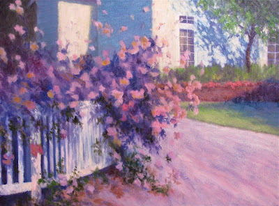
Coming Up Rosy
Original oil painting 18x24"
by Susan Roux


Just as I was pondering possibilities on how to adjust my painting, a special phone call came in. It was from the master himself, Don Hatfield. He offered helpful suggestions. Don't you just love a good critique? I embrace them. A non-biased opinion that recognizes your achievements and gives good advice on how to make your painting stronger. Good points and bad points, strengths and weaknesses are welcomed bits of information.

Having heard someone's opinion shouldn't mean that you jump right in adjusting what you've been told. After all it's still your painting and you make the final decisions on what actually gets changed and adjusted. Don pointed out the lawn edge. "Have the landscapers come in, cut out a corner of the driveway, put down new soil and plant more grass." Curving the lawn to draw in the viewer more gently seemed a very good suggestion. It doesn't remove it as a pointer, just swirls you in for a softer approach.

Softness. It seemed to be the overlying feeling of this painting. I'd been extremely cautious to keep my roses soft and after talking to Don, I began to notice other places that could use softening. I also found the entire painting too cool. I went in with yellows. I hit some of my flowers. I hit some of my leaves. (Key word here is some) I warmed the driveway and curved it in loosing the hard line at it's edge. I liked what it did to the painting. Softening that line just added to the softness of my blossoms. I proceeded to soften the tree shadow and the bottom of the brick wall.

I'm very pleased with this painting. I have to admit, it became somewhat of a scary thing to do it this way in front of you. I was really exposing my thought process. What if it all fell apart? I tried to ignore that crippling voice. I can do this, I told myself. I pushed on. I wouldn't accept mediocrity.


I was happy with the play in my roses. Using a variety of colors, as explained in Part 3, really helped this to happen. Some blossoms are left in shadow, others catch the light brightly, while still others are in softer sunlight. I was able to regain my focal point to the roses easily by adding lighter yellows. I also, ever so slightly, punched the darks around one blossom.

Thanks for bearing with me as I shared my journey through a painting with regards to design. Sticking to one original thought without wavering is essential for a strong design. Even when the paint begins to pull you in a different direction, as mine did in Part 3, don't let it win. Remember you're in charge of your painting. As I tell my students. You're in control of your painting even when you feel totally out of control! For beginners who struggle with brushstroke, this always gets a hardy chuckle. The decisions you make when choosing colors and where you apply them is uniquely your own. So take some time while painting to make good decisions and try to keep in mind, the power of design.

Thanks again, Don. You're such an amazing teacher...

Wednesday, January 5, 2011

Design, Part 3


Work in progress
(still not done...) 18x24"
by Susan Roux

Color and value. Those magical tools that keep artists addicted. Make a color change or a value change and you can redirect the viewers eye instantly. How do you keep it all in control?

First of all, don't loose sight of your initial plan. Second, when it comes to color with respect to design, repeat it. Color has the ability to hop the eye from one place to another. To keep your viewer exploring the entire canvas, repeat colors and their eye will bounce around in rhythms.

If you don't get too caught up with local color and build your darks throughout your painting using the same colors, you'll establish a color harmony. Some people like to limit their palette to ensure harmony, but others like myself paint with a palette-full. Either way can work.

With harmony in mind, I worked the rosebush. I used shadow values. This allowed me to take my time establishing where I want sunlight to move across it.


Notice how color was added randomly at this stage. This keeps the eye interested and moving. Even in this close-up, where there isn't information to identify the subject, the eye dances around in varied movements. Had I chose to paint each blossom identically, the eye would quickly tire and the exploration would cease.


Next I began adding sunlight to the blossoms. I took my time, stepping back frequently, making sure to retain variety. So far so good.


It became trickier as I added sunlight to the greenery. The deep rich darks that added contrast to the blossoms were being lost. To bring the painting to completion, close attention to value is necessary. Adjustments need to be made. This is when being able to critique yourself becomes critical. You need to ask yourself, what's wrong and how do I fix it?

The answer isn't always easy to find. The eye will travel to the place of most contrast and the sharpest edge. Unfortunately, as I lost the high contrast around my blossoms, the spot of highest contrast and sharpness became my top window pane. Oh man, what a pain!

So here is my dilemma. I've purposefully kept my blossoms in loose edges to project their softness. Each time I would crisp one too much, I didn't like the stiff feeling it created. Now to keep with my initial idea of the roses being my focal point, I must figure out a way to retain the attention there. I do like the idea of the blossom reaching out to the window. It helps in the exploration of the canvas. As my eye goes to this window, it picks up on the tree shadow and swoops back down to catch the blossoms on the ground.

I thought I was posting a completed painting today, but as I review the many photos I took, its clear to me that my painting lost drama along the way. I've never photographed a series of my work in progress before. It's proving to be a very interesting tool. Also I'm finding that talking about my process is a good learning tool as well. I hope you'll follow along as I push myself for improvement...

Friday, December 31, 2010

Design, Part 2


Work in Progress 18x24"
by Susan Roux


After establishing the lines, blocking in the big shapes was next. Paying attention to what's in light or shadow and blocking it in accordingly will give you a quick visual of your plan. It's sort of like your blueprint for the painting you're creating.

At this point, you've invested very little time and if your design is flawed, things should jump right out at you. Adjustments can be made easily and painlessly now. Look at the sizes of your shapes. Are they varied enough? Are they interesting to look at? Think of your original idea. Is your painting still supporting that? So far so good. I noticed the shadow on the lawn also points to the roses. Though it's good supporting motion, I must caution myself on not directing the viewer too abruptly or the painting will loose interest.

We want the viewer to explore the entire painting, not just one spot. Keep their eye dancing all over, that's the plan.

The big shapes were a bit difficult to completely establish, since the rosebush is airy. I made certain to carry my background shapes beyond where I thought they belonged to allow room for some play with the rose edges.


I began placing my roses with a value darker than its final highlights. I found patterns in sun/shadow play in both the fence and the house. Stepping back helps you identify potential problems before you develop too much detail. Adjustments are always easiest in the early stages. I was focusing primarily on the outer shape of the rosebush, trying to keep it interesting and varied. Stepping back helped me notice a snow storm effect. Before it turns into a blizzard of pink and white, swallowing the entire canvas, adjustments need to be made.

I keep thinking of design throughout the painting process. How is my eye traveling on the canvas? As soon as I put in something that becomes too confusing for my eye to differentiate one thing from another, a caution flag goes up. At any point during the development of your painting, when you've just added something that doesn't support your original idea, it's time for an adjustment.


I made certain to calm the white snowflakes in the background. The further I developed the rosebush, establishing some of its density as a form, the less conflicting my pink and white dots became.

To keep the eye moving, I'm painting in directional strokes as I work my dark values. Notice the repeated movement from upper left to lover right in both the darks in the rosebush and the tree shadows on the house. While this movement in the roses is supporting the focal point, the house shadow is pulling you away from it. It works well because it's creating a new rhythm and a bit of tension. The movement is no longer just pulling you towards the roses as in the original line drawing. Now the eye begins to dance diagonally as well. To prevent the eye from completely going off the canvas on the right, the tree trunk directs you down and small dark strokes in the greenery calmly pull you back towards the center.

Color and value also play an important part in moving the eye around. They are the elements of design that are the most noticed. Unlike the first lines of design that remain stable throughout, color and value continue to be adjusted right to the very end. I'll talk about that in my next post...

Tuesday, December 28, 2010

Design


Work in Progress 18x24"
by Susan Roux

Good design. How important is it? Is it important to you?

Artists will tell you of the importance of good design, but often have trouble explaining it. That's because there are many elements that affect design. Elements such as line, proportions, value, patterns, color, texture, etc. In a way we can think of this as complicated or as I prefer to see it, giving us lots of tools to help achieve a good design.

A good design will hold your viewers eye, sending them on an exploration of your entire canvas.

It isn't extremely complicated. As a matter of fact, it can be quite simple. Keep your viewers interest. How do you achieve that? Shake it up a bit with variety to keep the eye stimulated and traveling about. You can focus on any of the design elements, use them in proportions near 2/3 to 1/3 and you're already off to a great start.

Design comes in right from the start. It isn't something that just happens on your canvas. Consistent good design is planned. When you select a photo or arrangement to paint, there's always something about it that struck you, otherwise you wouldn't have chosen it in the first place. Identify that. Know why you've chosen a particular image to paint.


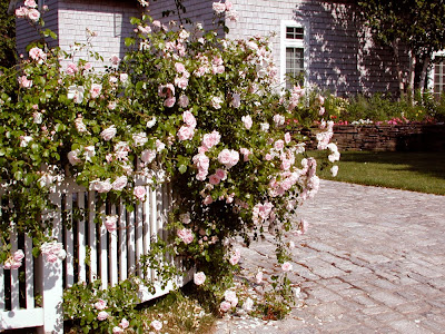
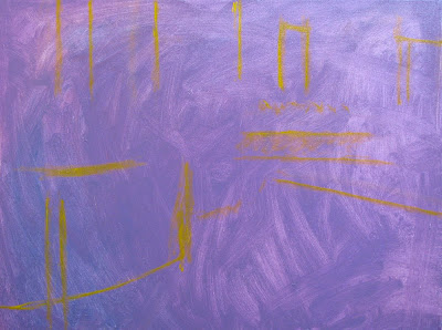
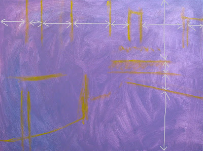
Here is the image I'm working from. It's quite obvious by the way I took this photo that the rose covered fence is what struck me most. If you think in terms of thirds, it's covering about 2/3 of the canvas. Rather than begin with an intense drawing of this complex scene, I chose to place my basic design lines first.


As I painted them in, I adjusted them. Though I was putting lines, my mind was imagining the bulky shapes these lines represented. I had to move several of them. It's a great time to back away and imagine your image within the boundaries you've created. At this point I was concentrating solely on design. Where am I going to place the components in my painting and how will they interact with each other in this placement?


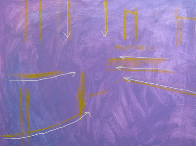
Notice how the lines already travel your eye in a unified direction. As I stepped back to imagine my scene, I thought of the direction things were pointing. Keeping in mind that my floral fence was my center of interest, I could see the movement in my painting was already supporting that. Don't loose sight of your initial idea. If it remains your goal throughout the painting process, the result will be more powerful than if you switched ideas on yourself along the way.


Next I looked at intervals. To keep the viewers eye interested, variety is necessary. Were my intervals varied enough? Not at first. I had to move most of these lines, because as I followed my photo, the lines seemed to be evenly spaced. For the sake of a painting, even if representational, it's better to create interest than to copy an image precisely. (Save that for when you're doing portraits.)

Paying attention to the bare bones of your painting is simple. By doing so, it allows you to concentrate on what you've created that is already working for you. In this case I identified direction. Don't you just love pointers? Make sure their helping you and not pointing the viewer in the wrong direction...

As I continue to develop this painting, I'm keeping in mind this directional movement. I'm supporting it with the colors I'm choosing and the values I'm placing. The bare bones are there to help me, but it's necessary to keep adjusting things as I go along. This will help me build upon the initial structure. Concentrating on good design is a good way to improve your work.

I'll continue to show you the development of this painting, explaining my thought process as I make choices. You'll see how the various elements of design come into play individually. Breaking things down simplifies the process. So rather than have to concentrate on all the elements of design at once, thinking of them one at a time and adjusting them, just as I adjusted my initial lines, becomes easy to understand.