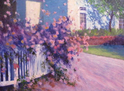
Work in Progress 18x24"
by Susan Roux
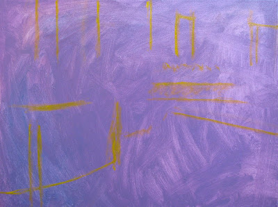
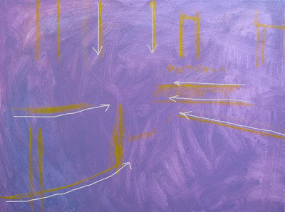
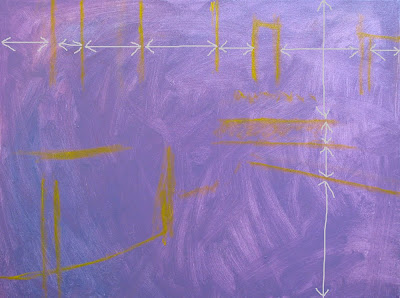
After establishing the lines, blocking in the big shapes was next. Paying attention to what's in light or shadow and blocking it in accordingly will give you a quick visual of your plan. It's sort of like your blueprint for the painting you're creating.
 At this point, you've invested very little time and if your design is flawed, things should jump right out at you. Adjustments can be made easily and painlessly now. Look at the sizes of your shapes. Are they varied enough? Are they interesting to look at? Think of your original idea. Is your painting still supporting that? So far so good. I noticed the shadow on the lawn also points to the roses. Though it's good supporting motion, I must caution myself on not directing the viewer too abruptly or the painting will loose interest.
 We want the viewer to explore the entire painting, not just one spot. Keep their eye dancing all over, that's the plan.
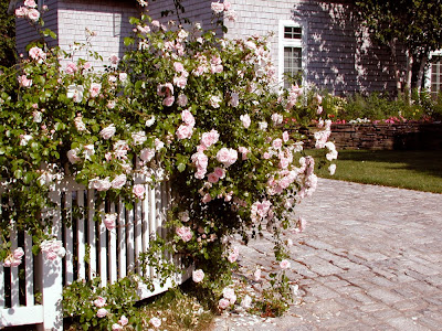
The big shapes were a bit difficult to completely establish, since the rosebush is airy. I made certain to carry my background shapes beyond where I thought they belonged to allow room for some play with the rose edges.

I began placing my roses with a value darker than its final highlights. I found patterns in sun/shadow play in both the fence and the house. Stepping back helps you identify potential problems before you develop too much detail. Adjustments are always easiest in the early stages. I was focusing primarily on the outer shape of the rosebush, trying to keep it interesting and varied. Stepping back helped me notice a snow storm effect. Before it turns into a blizzard of pink and white, swallowing the entire canvas, adjustments need to be made.
I keep thinking of design throughout the painting process. How is my eye traveling on the canvas? As soon as I put in something that becomes too confusing for my eye to differentiate one thing from another, a caution flag goes up. At any point during the development of your painting, when you've just added something that doesn't support your original idea, it's time for an adjustment.

I made certain to calm the white snowflakes in the background. The further I developed the rosebush, establishing some of its density as a form, the less conflicting my pink and white dots became.
To keep the eye moving, I'm painting in directional strokes as I work my dark values. Notice the repeated movement from upper left to lover right in both the darks in the rosebush and the tree shadows on the house. While this movement in the roses is supporting the focal point, the house shadow is pulling you away from it. It works well because it's creating a new rhythm and a bit of tension. The movement is no longer just pulling you towards the roses as in the original line drawing. Now the eye begins to dance diagonally as well. To prevent the eye from completely going off the canvas on the right, the tree trunk directs you down and small dark strokes in the greenery calmly pull you back towards the center.
Color and value also play an important part in moving the eye around. They are the elements of design that are the most noticed. Unlike the first lines of design that remain stable throughout, color and value continue to be adjusted right to the very end. I'll talk about that in my next post...